Blog

My mac tiling setup inspired by Omarchy

Things I really like about Omarchy

  • The tiling via Hyprland (at least in theory)
  • Keyboard driven usage of the Operating System
  • Straight sharp corners/edges
  • No animation, or adjustable animation between workspaces
  • Frameless web apps
  • Snappiness

My current mac setup inspired by Omarchy

Homebrew

Homebrew is ground zero. This is where we start. Install it by opening a terminal and pasting the install script from https://brew.sh/

JankyBorders

Install via Homebrew: https://github.com/FelixKratz/JankyBorders

This will be used afterwards to clearly show which window is active.

Karabiner Elements

Karabiner-Elements is a powerful and stable keyboard customizer for macOS.

I mainly just want it for one task: creating a so-called HYPER-key. A combination of left-shift, left-ctrl, left-cmd and left-alt by the keypress of CAPS-LOCK (Which I don't really need otherwise)

Install here: https://karabiner-elements.pqrs.org/

Boot it up, and go to Settings -> Complex Modifications -> Add pre-defined rule and enable caps_lock to command+control+option+shift.

remember to grant permissions as per documentation: https://karabiner-elements.pqrs.org/docs/getting-started/installation/

Aerospace

Aerospace is the most integral part of the tiling setup. Install it via Homebrew: https://nikitabobko.github.io/AeroSpace/guide#installation

My config file can be found here

Sketchybar

Sketchybar aims to create a highly flexible, customizable, fast and powerful status bar replacement for people that like playing with shell scripts.

I don't really like to play with shell scripts, but I find the customization straight forward for my needs.

Install here: https://github.com/FelixKratz/SketchyBar

My sketchbar config can be found here.

Make decisions regarding workspaces

Window tiling can be nice, but in my personal experience, its very rarely positive with more than two windows in the same screen. I even mostly prefer it at one.

This means that you need to use workspaces dedicated for different purposes.

This is my setup:
Workspace 1: Browser
Workspace 2: Design (Mostly Figma)
Workspace 3: Code (Terminal + editor)
Workspace 4: Mail
Workspace 5: Music
Workspace 6: Project Management Tools
Workspace 7: Empty
Workspace 8: Empty
Workspace 9: Empty

On my empty three last slots, i juggle things like Notes, Discord, Whatsapp, Messenger and other random apps I don't dedicate a workspace for (yet).

As you can see from this setup, its actually only workspace 3 that per default has two tiles. Most others are mainly one. Why? Because many of the UI's are clunky. Take Spotify as an example. Even on my 27" screen on a 50% tiled layout, it feels crammed. Same goes for Mail or Figma.

Does it mean window tiling system is the wrong approach? Maybe. Time will tell. But the instant switching of workplaces are the main key useage for me. This ties back to my initial point on "things I like" regarding window tiling. I like it in theory, but I'm not sure yet if I actually like working with tiles all that often.

It's a bit similar to the "multiple screens or one screen" discussion. I had two screens in the beginning of my career, but quickly found out that it was not a good thing for my focus or for my neck. I've been using one screen for most of my life, and prefer it that way. I focus on one thing at the time, and don't like noise on other screens. The same applies to tiles. I don't want live updates from my CPU processes while I'm writing a blog post.

My most used commands

cmd + 1 = Workspace 1
cmd + 2 = Workspace 2
cmd + 3 = Workspace 3
...
cmd + pageUp = Previous Workspace
cmd + pageDown = Next Workspace
cmd + home = Workspace 1
cmd + end = Workspace 9

cmd + shift + 1 = Move selected window to workspace 1
cmd + shift + 2 = Move selected window to workspace 2
cmd + shift + 3 = Move selected window to workspace 3
...

cmd + left = focus to left window
cmd + down = focus to below window
cmd + up = focus to above window
cmd + right = focus to right window

ctrl + shift + left = focus to left window
ctrl + shift + down = focus to below window
ctrl + shift + up = focus to above window
ctrl + shift + right = focus to right window

alt + f = fullscreen (toggle on/off)
cmd + j = horizontal / vertical split (toggle)
hyper + f = floating (toggle on/off)
hyper + d = reset the tiles back to default

hyper + m = switch to merge mode
arrow keys = merge with [direction] (in merge mode)
space or esc = escape merge mode

hyper + w = workspace mode
left/right = go to workspace [direction] (in workspace mode)
shift left/right = move window to prev/next workspace
up/down = go to prev/next monitor
space or esc = escape workspace mode

hyper + r = resize mode
left = decrease width (in resize mode. add shift to have bigger increments)
right = increase width (...)
up = increase height
down = decrease height
space or esc = escape workspace mode

Wishlist

Straight borders, but thinner. The Jankyborders solution needs to have thick enough borders to cover the rounded ones from Apple. Kind of meh.

Ability to freely decide if a window should be centered, tiled etc. without regards to other tiles. ie. one window on the workspace should be able to be tiled regardless of being alone on the workspace. Lets say I just want to drag a file from the desktop into another window. Then I'd like for the window to just be on the left side, leaving the desktop visible.

Even though I don't use more than two tiles often on the screen, when I do it's likely 3, and then I want a bento-style and not three columns or rows. It'd be very cool if the third frame in a workspace would combine with the second in a similar way to Omarchy automatically as a default.

Final thoughts

I'm giving this setup some time now, but it will be interesting to see if I prefer it over the previous Rectangle-based setup and old-fashioned cmd-tabbing between apps.

Link to my config files

How does it look?

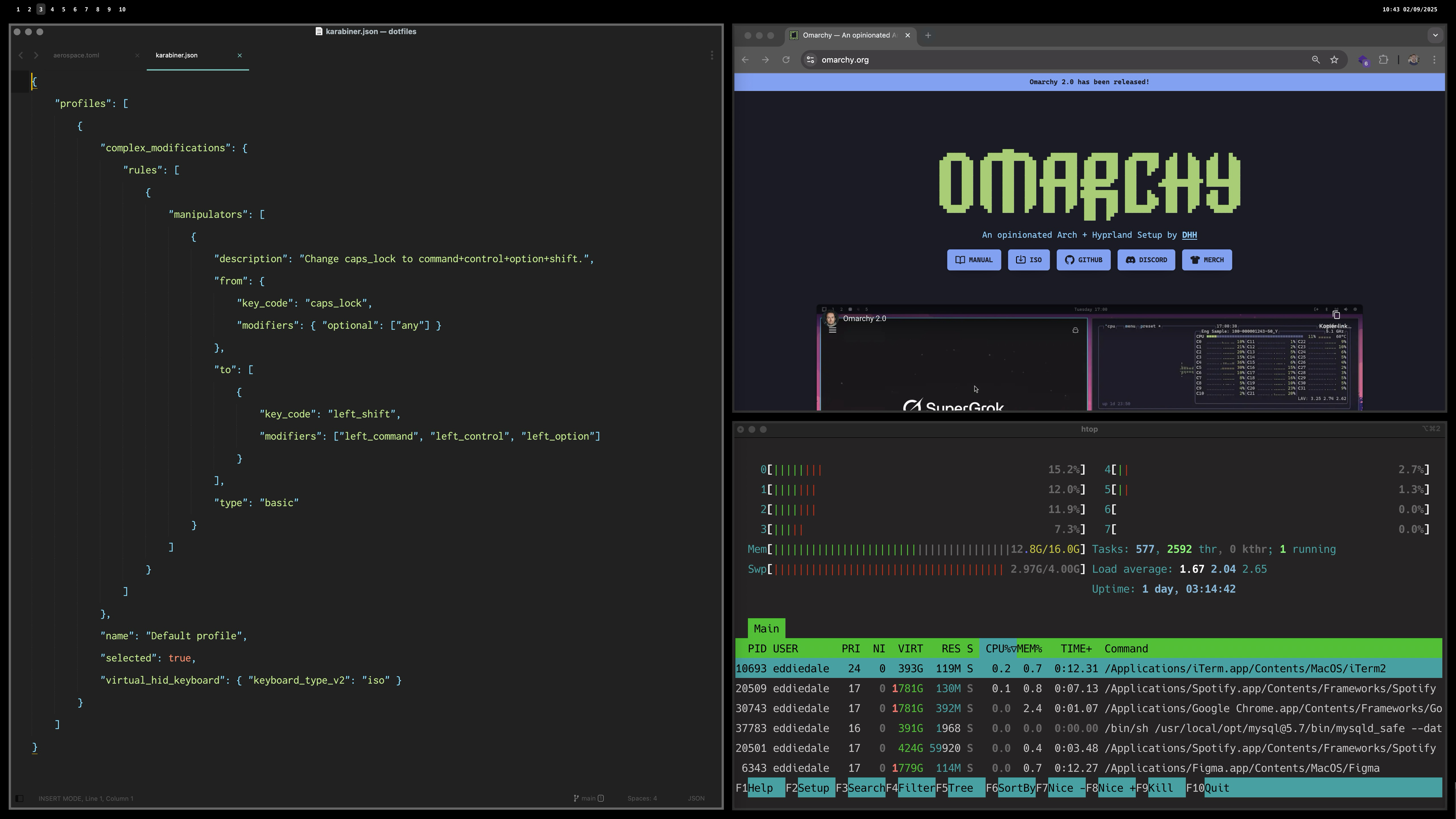
The obligatory screenshot: "very busy work-person doing very important things"
Convenience over purism

I’m fascinated by photographers using film cameras, guitarists on plain old tube amps, authors writing books with pencil on paper, and the list goes on.

The same goes for Vim (and Neovim) for programmers. It's very pure and inspiring to watch.

However, I have found that I am more of a "convenience-over-purism"-type of person.

Modern guitar modellers are close enough to tube amps for my needs.

A digital Fujifilm has enough manual controls to get close to that «film-feeling» for me.

This is also the reason why Omarchy might be a step too far in customization for my liking. (update from a week later into the future: it's not)

Sure, Apple and macOS have their issues, but it’s close enough for most of my needs.

That being said I draw a lot of inspiration from Omarchy, integrating some of its elements into my macOS setup. And I also really like DHH's energy. It's very captivating and almost had me buying a Framework laptop I don't really need.

Omarchy inspired Mac setup

I'm really inspired by DHH and the push for Linux and Omarchy.

I even installed Omakub last year on an old mac to get a taste of Linux. Omarchy takes everythin a tad further in customization in a way I really enjoy the looks of. I'll probably wipe the Omakub and try out Omarchy soon, but that is not ment as a work computer. Just as an exploration.

Because, even as inspired by it as I am, I try to pragmatically think first; "What is it that speaks to me?" and "Would it be possible to get close enough to it without such drastic measures as changing the OS?"

This is currently the path I'm on. I'm working on getting my Mac close enough to the Omarchy look and feel, but still keeping most of what I enjoy and use on the daily in the Apple ecosystem.

I've come to realize that what I want are mainly two things:

  1. Better window tiling and spaces-management
  2. A more keyboard driven usage of the computer

To try to get closer with my Mac, I started by adding Yabai and skhd.
This got me pretty close, but the process got into a halt when I realized that even with all the configging and adjusting done, I still needed to boot in recovery mode and disable SIP to get where I really wanted.

What did I really want? Mainly instant switching between spaces (screens). The native spaces (Mission Control) from Apple has default swipe-animations between them (which can be disabled), but even in a disabled state it has an annoying fade. Furthermore without disabling SIP the keycommands for moving application screens between spaces didn't work.

So I reached a crosspoint. Either I'll go further down the Yabai+skhd route, or I'll try the alternative: AeroSpace, which has some alternative ways of dealing with this issue without needing SIP disabled.

I chose AeroSpace, and this turned out to be a massive improvement in what I looked for.

Now I have instant switching between spaces, simple commands to move windows between them, and good window tiling.

Along the way I've also installed:

Raycast, which I'm still evaluating if I really need or not.

Karabiner Elements (for making my Caps Lock a hyper-key).

JankyBorders to better highlight the selected window.

I might also dive into Sketchybar, but for now I'm happy without it.

Yey, your CMS has an update!

(But no one cares… except you.)

Exciting? Maybe for you.
Your client? Not so much.

They probably won’t notice.
They definitely won’t ask for it.
And they almost certainly won’t want to pay for it.

After all, the site still works, right?

But you as a developer know what happens if you don’t keep up

• Bugs creep in
• Plugins break
• Security holes widen
• And soon you’re knee-deep in technical debt

Still not sexy. Still not billable.

Maybe your clients are more forward-thinking than mine, but personally I’ve found this kind of work really hard to get paid for.

Meanwhile, the update notifications pile up

Each one adding a bit more guilt to your day. And guess who’s to blame if things go sideways? Yep — you.

You’re stuck maintaining tech that no one wants to maintain, for a fee no one wants to pay, on a schedule no one respects.

But here’s the kicker

Ignoring updates might save money now, but it often leads to bigger, more expensive problems later.

By the time things break — or the site gets hacked, or a plugin stops working, you’re not just updating anymore.
You’re rebuilding. Troubleshooting. Firefighting.
And that costs a lot more.
Both in time, money, and client trust.

“This maintenance task you didn’t want to pay for six months ago?
Now it’s an emergency fix that’s five times the cost.”

– Not a fun conversation.

(written with help from ChatGPT)

Slow development

Over the last days I have found it interesting to follow the thread on Reddit regarding the direction Laravel is heading.

I am not using Laravel a lot myself, so I follow it rather from the perspective of general software – or even company – development. Simply seeing the fact that a lot of long-term users slowly long back to simpler times. Some even ask straight up for suggestions on Laravel 5-like frameworks out there.

In a software sense, I draw some parallels between the Laravel situation to my own experience with Craft CMS, which I've used a lot the last 7 years. Already back with the introduction of Project config back in Craft 3.1 I felt it switched from being a very simple CMS I could co-work with designers and non-tech people on small to medium sized sites in a very lean way. We could both edit and modify CMS fields on the go, and it made for a very frictionless way of working.

The optional project-config soon became non-optional and have been a source of many headaches since. Most have been solvable and probably – as the reddit post also points out – just points towards myself (and my colleagues) lack of technical expertise. As the OP writes: "People will probably downvote me for this and say it's a skill issue, and maybe it is..".

Even if it is a skill issue, it's an interesting phenomenon. Updates and incremental improvements are often only thought of in a positive light. "great, new features!". But everything comes at a cost.

Another CMS system I use, which I feel stand out in the matter of slow and steady gradual and highly thought-through development is Kirby CMS. I heard in a podcast about a year ago from its founder something that has stuck with me to this day, which I feel shows a different thought process entirely. Since the podcast is in German (and I'm not even German myself, but know enough to get by) I'll summarize the essence:

In development it’s often tempting to scrap all of the work and start new. But the long term view is important. For Kirby 2 everything was written from scratch. It was so tempting and nice to use new tools, tech stack, code editor and everything around it. But this was something he (Bastian) called a big mistake, and definitely nothing he repeated again for versions going forward. The main captivating idea that stuck for me was the line "thinking like a gardener". It requires patience and gives a different type of satisfaction than the "flashy new tools"-direction, and is something I find very noble.

Unfortunately consumerism and the fast-paced world we live in has no time for slow development. Most small and slower moving projects dont survive. The really little content management system called Perch CMS back in the day was so much fun, but ultimately did not have enough buyers to keep going. Founders, investments and a ton of features would probably have kept the company alive, but to what cost? It would then have resulted in a completely different product in the end, and most likely it would have been worse.

Even though it feels like a losing battle, I cheer for the slow and steady ones out there. But maybe it's just me getting old.

Doubt

I'm more than ever doubting this public blogging thing.

I tell myself it's mainly for my own benefit, and I feel the arguments are there for it.

But despite this focus, I can't help but having the (non-existent) audience in my head when I write. And it makes me hesitate and hold back.

  • Maybe people look at me as a developer, and they find these other things I write very weird.

  • Maybe people kind of like my random posts, but find my posts regarding development really bad.

  • Maybe friends and family might see the blog and wonder why the hell I write these things publicly online?

  • Maybe future employers might read this and think I'm unqualified?

Imposter syndrome.

Fear of looking dumb.

What's the point anyway? It's not like important things are going on here. Its just kind of widespread random notes ranging from development to note-taking and anything in between.

But then the other side of my brain is saying; why are you so damn self centered? Just write, and live on. Nobody cares anyway. Stop acting like you're famous.

Maybe this is a case like Steve Jobs referred to in his Harvard Speech:

"You can't connect the dots looking forward; you can only connect them looking backwards. So you have to trust that the dots will somehow connect in your future. You have to trust in something - your gut, destiny, life, karma, whatever. This approach has never let me down, and it has made all the difference in my life."
Steve Jobs

I might of course be wrong, but somehow it feels like it's worth pushing through the resistance.

I don't know.

Judge Ideas, Not People

Remember that you can hold multiple, even conflicting opinions about the same person.

You can admire or be inspired by certain qualities or accomplishments without necessarily agreeing with all of their views.

Yes, even someone as polarizing as Elon Musk. It’s called nuance.

You can pick and choose which ideas to embrace and which ones to ignore.

Stop shutting down conversations by judging the messenger; listen to what’s actually being said.

Sometimes, controversial minds spark the best insights – if you’re open enough to hear them.

This makes me think about Apple's iconic Think Different ad-campaign:

Here's to the crazy ones.

The misfits.

The rebels.
The troublemakers.

The round pegs in the square holes.
The ones who see things differently.
They're not fond of rules, and they have no respect for the status quo.
You can quote them, disagree with them, 
glorify or vilify them.
About the only thing you can't do is ignore them.
Because they change things.
They push the human race forward.
While some may see them as the crazy ones,
 we see genius.
Because the people who are crazy enough to think 
they can change the world, are the ones who do.

Organized thinking and my search for the right tools

I just can't seem to find the right method. I've tried physical notecards, as per Ryan Holiday and Billy Oppenheimer. I found that to be too cumbersome and frustrating, and also had problems with the messiness of it.

I tried the digital version of it through Zettelkasten. Can't fully say why it didn't stick, but somehow basic Apple Notes was easier and more flexible to maintain for me. I've also tried Evernote, Notion and Obsidian, but they're all too complicated and bulky for what I want.

Mymind is interesting, and sort of works better than the other digital tools I've tried. The visual part is an important aspect that many of the other tools don't have good solutions for. It does however go quite far on the visual side, and doesn't feel great when it comes to slightly longer form note-taking.

Other options I've considered is to build out my home page with more sections dedicated to the needs I have (section for quotes, section for short notes-to-self, health, inspiration etc), but it does feel like a bit too large of a task at the moment.

I have fairly heavily used the native Apple Notes the last year. I've always used it, but the last year I've organized and used it a bit more structured. It's really not too bad, and thats why that still is my way of taking most notes.

Maybe all of this searching is in vain, and simply using Apple Notes is the best solution after all? The problem is just that I really prefer having physical files over the "locked in" apple notes in their cloud kind of a thing.

Which takes me back to using my own web page for this, because Kirby structures this stuff exactly how I want it. A folder per entry/thought/post, with a txt file containing the text content, plus all potential assets of relevance to it. Everything neatly collected in a named folder.

They say "write to think", and I think that through writing this post, I've learned that I probably should try out a MVP note-taking system straight on my own homepage using Kirby. 🤔

Note: I forgot to mention that I also tried a commonplace book system too. That definitely worked better than notecards, but I fell back on the fact that I don't really feel it works for me to purely have written words on a paper to compile my thoughts. Too often I want to include graphics.

Kirby collections

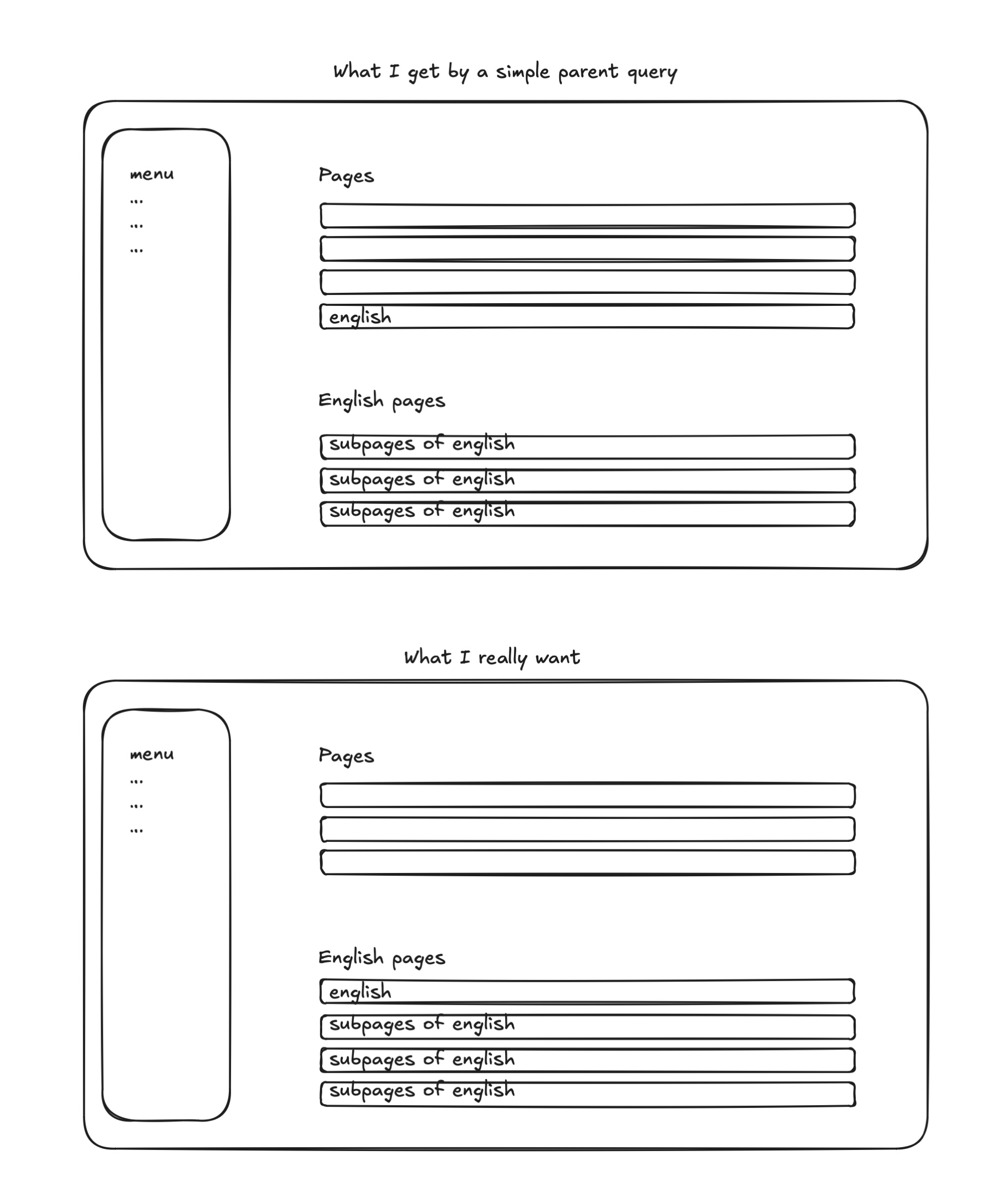
Sometimes I want to display all sub-pages of a certain page together with the parent page in the panel.

An example of this is a basic multi-language setup like 3-5 pages in a native language, plus a couple of english pages also. Some might prefer enabling multilanguage etc. for this, but to me a basic content structure is an easier solution on small pages.

Anyways, this is how I do it with collections.

The easy "out-of-the-box" solution that works well if its a blog, projects, products etc. (a collection or grouping of items) is to just use the parent query. But this of course doesn't include the actual parent which I want in this particular case.

Out of the box I haven't found a simple way to do this, so I use collections for it.

In a collection one can merge multiple queries together, which later can be used in the pages section as a query.

How could it look?

<?php
// file: site/collections/english.php

return function () {
    $englishChildPages = page('en')->children()->flip();
    $englishFrontPage = page('en');

    $allEnglishPages = $englishChildPages->merge($englishFrontPage);
    return $allEnglishPages->flip();
};
#The blueprint file
...
 ...
  pages:
   type: pages
   query: kirby.collections('english')

What the heck is up with all the flipping you might ask.

Because in this example, the front page is a single, and the child pages are a collection, I can only add the former to the latter, and not the other way around.

The result is then that the home page ends up at the bottom – which I don't want.

So I first invert the collection, then add the front page to the bottom, then invert the whole thing back. That gives me what I want.

Surely there are more elegant solutions to this, but this is my solution, and it does the job ✌️

Connecting to Linux from MacOS

Following up on my post from last week, I decided to install Linux on an old 2016 MacBook that was just gathering dust. I installed Ubuntu 24.04 and went through the Omakub installer.

This post will just be a short note-to-self on how to rsync stuff from MacOS to Linux and the other way around locally on my two machines.

Linux to Mac:

Currently on macOS Sonoma (14.6.1)

I needed to go to System settings -> General -> Sharing -> Remote login and turn this on.

To find the local hostname, click on the info-icon next to the "Remote login" lightswitch, and you'll see the host name and how to connect via SSH.

Mac to Linux (Ubuntu 24.04):

You can find your host name by going to Settings -> System -> Secure Shell.

Here one can also flip the light switch to turn it on, but somehow that kept flipping back off after closing settings for me each time.

To actually be able to connect to the Linux from my mac, I needed to install opens-client and openssh-server on it. Running the following did the trick:

sudo apt-get install openssh-client openssh-server

Conclusion

Now I can run this command in either direction to quickly connect to the other machine.

ssh username@hostname

Of course from here on it's easy to go further and rsync content back and forth, create aliases etc.

Btw. Derek Sivers recently wrote a small guide on how he syncs his stuff back and forth between a Linux and Mac. He also has a very good article on tech independence.